
Location intelligence for site selection
Find the neighborhoods that look like where you already win.
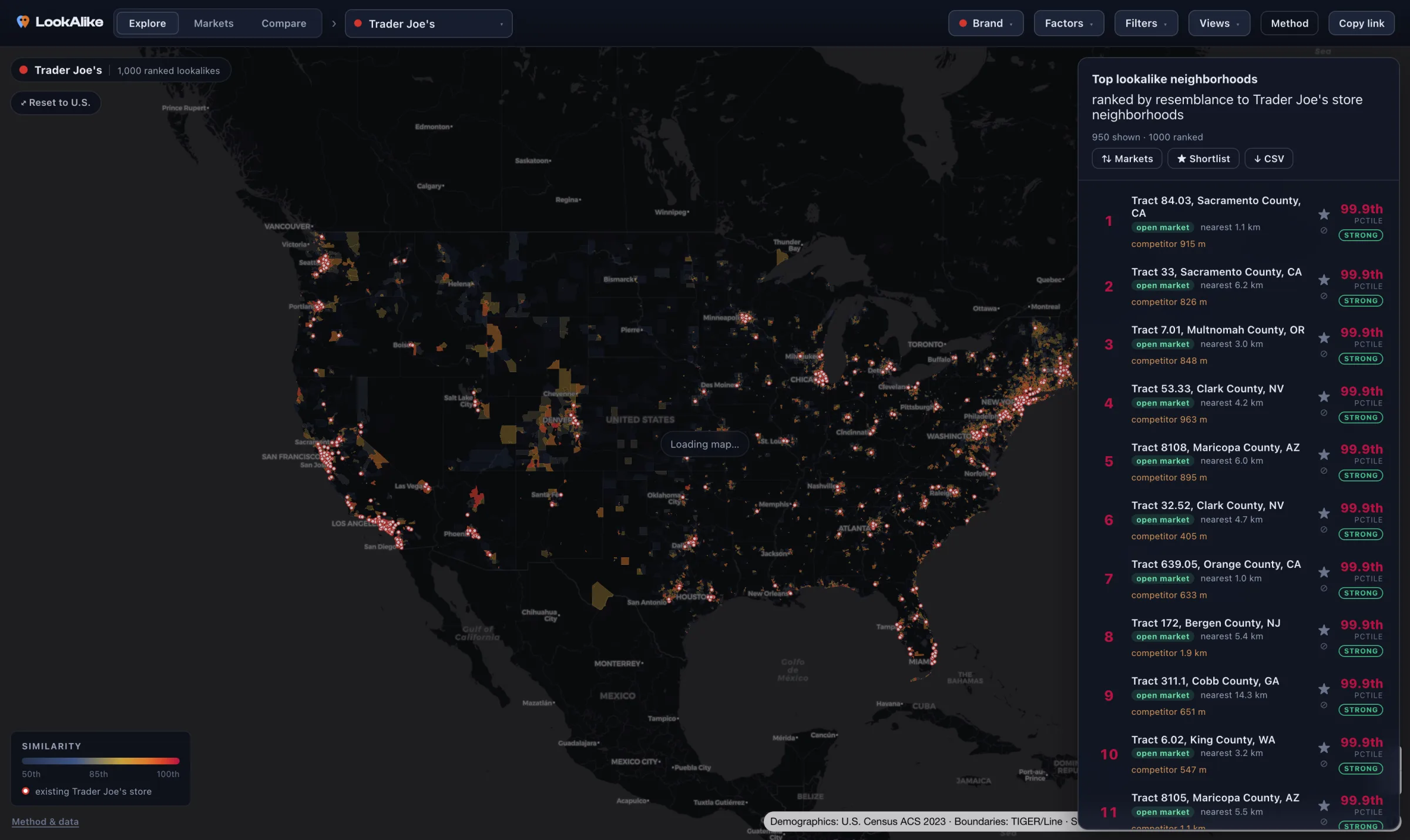
LookAlike profiles the neighborhoods around your existing stores, ranks every neighborhood in the country by resemblance to that footprint, and explains, feature by feature, why each one made the list.
- 83,008neighborhoods scored
- 21open-data features each
- 383metro markets screened
- Everyscore explained
Rank every neighborhood in the country on one map.
Pick a brand, yours or any US chain, and the national map lights up the neighborhoods that most resemble where it already operates. Only high-similarity areas are coloured, so the map points you at where to look first.
- Filter to open marketsHigh-resemblance neighborhoods where the brand has no store yet.
- Score live in your browserReweight and re-rank instantly, with no batch jobs to wait on.
Screen markets before you screen neighborhoods.
The Markets report aggregates neighborhood resemblance for 383 metros, each with a scorecard for your brand, so an expansion team can choose which market to examine first.
- FitHow strongly the metro's neighborhoods resemble your footprint.
- OpportunityThe open, high-resemblance share, adjusted so big metros don't win for being big.
- HeadroomOpen lookalikes per existing store, and competitor presence.
Markets · ranked for Trader Joe's
- 1Fort Collins–Loveland52% open
fit 86th · 45 open · 1 store · 30% rival
- 2Santa Cruz–Watsonville52% open
fit 86th · 36 open · 2 stores · 25% rival
- 3Santa Rosa–Petaluma46% open
fit 81st · 56 open · 3 stores · 25% rival
- 4Boulder45% open
fit 80th · 35 open · 1 store · 32% rival
- 5Olympia–Lacey–Tumwater43% open
fit 84th · 26 open · 2 stores · 28% rival
- 6Madison41% open
fit 78th · 62 open · 1 store · 26% rival
Every match arrives with its explanation.
Open any neighborhood to see its fingerprint against your brand's archetype: the features that drive the match, where it diverges, and a similarity percentile beside an absolute fit band. The score never stands alone.
- Percentile and bandNational resemblance, plus a Strong, Moderate, or Weak fit against your own stores.
- Reliability flagsNoisy small-area estimates are marked, so you know which numbers to trust.
Neighborhood fingerprint · vs Trader Joe's
A shortlist your team can stand behind.
Every ranking is built from features you can see and move, and every match opens into the reasons behind it: the features that line up, where a neighborhood diverges, and how much to trust the estimate.
Your analysts bring the judgment. LookAlike ends the work of scanning 83,000 neighborhoods by hand and hands them a ranked, explained starting point they can take straight into the room.
- Every match explained
- Sources kept
- Reweight and re-rank live
- Yours to export
Start with built-in brands, then use your own store list.
Explore curated national brands, add any US chain by name, or upload your store list to rank the whole country against your real footprint. LookAlike gathers the open data for you; there is no data subscription to sign.
- Weight your winnersUse a performance column to tilt the archetype toward your best stores.
- Private, versioned datasetsUploads stay in your workspace and load again later without re-uploading.
Open-data foundations
- ResidentsPopulation, income, education, and household makeup for every neighborhood.
- Places & accessRoads, walkability, and the businesses already trading around a site.
- Provenance keptEvery feature keeps its source and geographic level, visible in the app.
No data subscription to sign. Every feature keeps its source, geographic level, and normalization, so any score can be traced back to the numbers behind it.
Adjust your assumptions with visible sliders.
Every ranking is driven by weights you can see and move. Six factor themes open into per-feature control, and the map and rankings re-score live in the browser.
- Presets and scenariosBalanced, affluence-led, urbanism-led, and community-led, saved and shareable.
- Exclude by choiceDrop race and ethnicity with one click, with the trade-off explained.
Weight the factors
Balanced- Income, wealth & housing1.0×
- Education1.0×
- Density & transportation1.0×
- Age & household type1.0×
- Race & ethnicity1.0×
Compare two brands on one map.
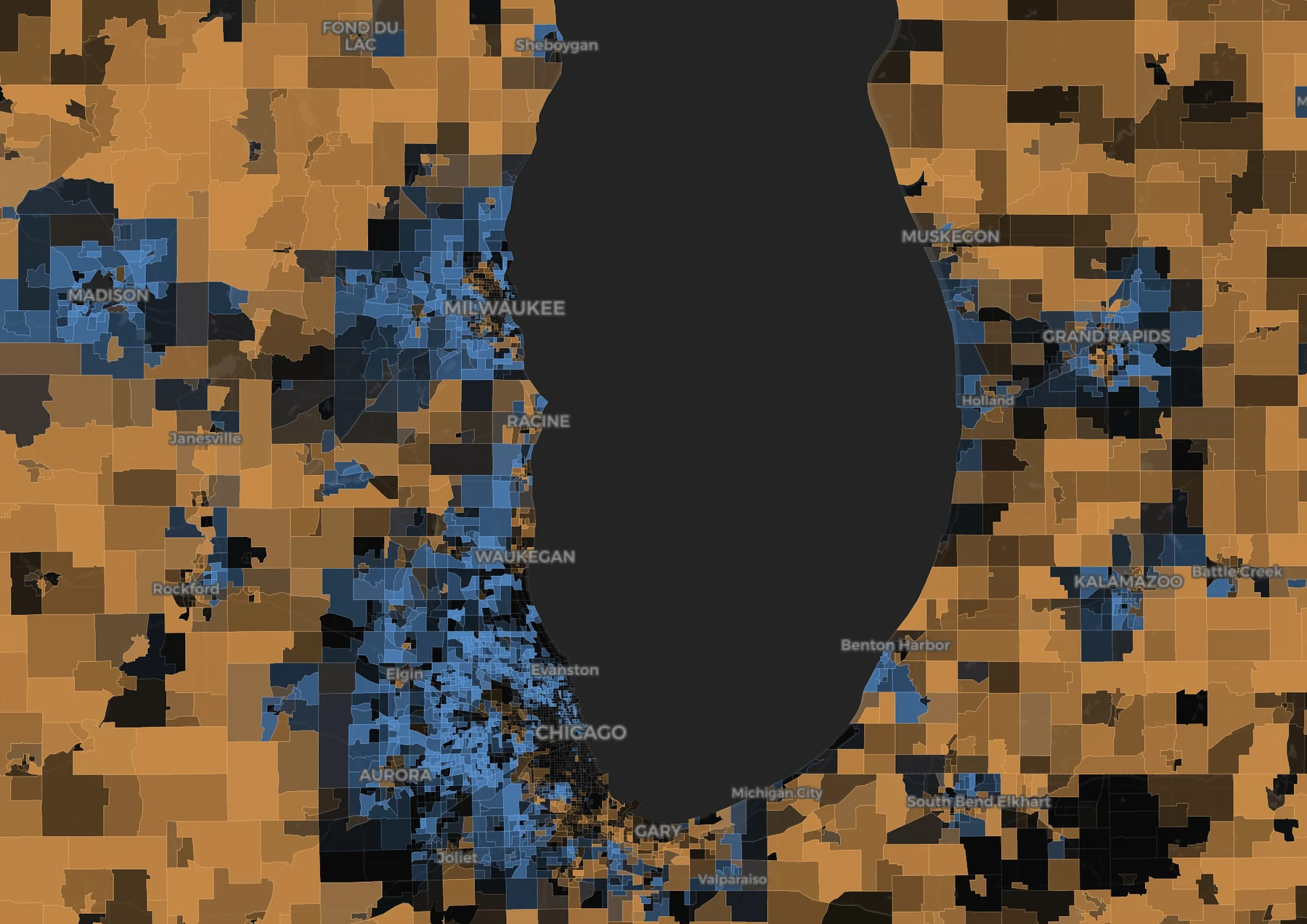
Compare your concept with a rival, or a built-in brand with your own upload, to see which brand each neighborhood resembles more closely and how contested the ground is.
- Three-way splitNeighborhoods that match you, resemble both, or match them more closely.
- Overlap countThe number of neighborhoods both brands would fight for.
Turn the map into a deliverable.
Build a defensible shortlist straight from the map. Star neighborhoods, annotate the reason, the contact, and the next step, and flag bad matches as not a fit to review what they share.
- Print-ready reportA PDF a broker or franchise developer can hand to a client.
- CSV and share linksFit bands, reliability flags, competition columns, and the full scenario in one link.
Shortlist · 4 saved
- 1
Tract 84.03, Sacramento County, CA
- 2
Tract 33, Sacramento County, CA
- 3
Tract 7.01, Multnomah County, OR
- 4
Tract 53.33, Clark County, NV
Built for people who put pins in maps for a living.
Retail & restaurant expansion
LookAlike screens 383 metros and 83,008 neighborhoods against the footprint you already operate, then explains why each candidate earns a place on the list.
Read moreFranchise development
Screen territory whitespace against your existing franchisee neighborhoods, then give candidates a clear, evidence-backed record of the comparison.
Read moreCRE brokerage & tenant rep
Rank markets and neighborhoods against the tenant's own footprint, explain every candidate, and give the deal team a shareable record of the assumptions.
Read moreWhat else should you know?
What does LookAlike actually tell me?
Where to look first. It ranks every US neighborhood by how closely it resembles the places you already win, and opens every match into the reasons behind it — a ranked, explained shortlist your team acts on.
How many neighborhoods and features does it use?
LookAlike ranks all 83,008 US neighborhoods, one per census tract, on 21 open-data features covering residents, workers, access, and nearby business. Every score is explained feature by feature.
Can I score my own stores, not just built-in brands?
Yes. Upload your store list and it becomes a private, versioned dataset in your workspace, then rank the whole country against your real footprint. You can weight the archetype toward your best locations.
Does it work outside the United States?
No. Coverage is every US state at census-tract level. There is no international coverage today.
More on how the screen works and who LookAlike is for.
See your brand's map.
Pick a plan, upload your store list, and rank every US neighborhood against the places you already win.